
Introduction to color theory and color palettes
I’ve always been intrigued by color and how it can turn a straightforward concept into a breathtaking visual masterpiece as a creative person. Understanding color theory can enable you to develop striking and lovely color schemes and palettes for your creative projects. Color theory is the art of blending colors pleasingly and harmoniously. I’ll discuss the color wheel, examine different color schemes, and share my love of color with you, in this essay. we’ll discuss color’s significance in design, branding, and psychology and introduce you to Muzli Colours, one of my favorite color tools.
A color palette is a collection of hues that go well together and produce a unified appearance. Whether you’re developing a website, a logo, or a piece of art, picking the proper color scheme is crucial for producing an appealing and functional design. You’ll be well on your way to developing magnificent color schemes that will set your work apart from the competition if you comprehend the fundamentals of color theory and how to use the color wheel.
So let’s explore the real-world example of color and learn how to develop enticing color schemes that will bring out your inner artist.
Understanding the color wheel
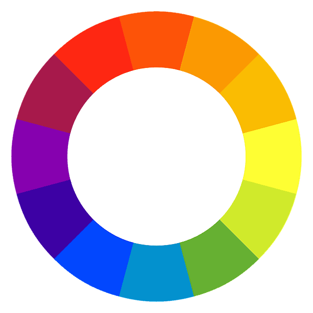
The color wheel is a circular diagram that represents the relationships between colors. Since Sir Isaac Newton first developed it in 1666, it has been a crucial tool for designers and painters. The primary, secondary, and tertiary hues of the twelve basic colors that make up the color wheel.
Primary, secondary, and tertiary colors
Red, blue, and yellow are the three primary colors on the color wheel. These colors cannot be created by mixing other colors. Secondary colors are created by mixing two primary colors and one-click them together. Additional examples include the color combinations purple (blue and red), orange (red and yellow), and green (blue and yellow).
A primary color and a secondary color are combined to produce tertiary colors. For instance, the tertiary color red-orange is created by mixing the primary color red with the secondary color orange.

Complementary and analogous color schemes
Complementary colors are those that are opposite each other on the color wheel. They produce a striking color contrast when put next to one another, which may be highly colorful and arresting. Yellow and purple are two instances of complementary color combinations, as are red and green.
Contrarily, similar color schemes are produced by pairing hues and tones that are close to one another on the color wheel. These hues frequently complement one another nicely and produce a pleasing appearance. For example, a yellow-orange, orange, and red-orange color scheme is analogous.

Triadic and tetradic color schemes
Triadic color schemes use three colors that are evenly spaced around the color wheel. For instance, the colors that make up an orange, green, and purple triadic color scheme are all equally spaced from one another on the color wheel.
Tetradic color schemes, also known as double complementary color schemes, use four colors that are made up of split complementary color scales, out of two complementary pairs. For example, a red-orange, yellow-green, blue-violet, and red-violet tetradic color scheme might be made using two sets of complementary colors.

Using color tools to create stunning color palettes
While the color wheel is a great tool for understanding the relationships between colors, there are also many color tools available that can help you with color palette generators to create stunning gradient-inspired color palettes. One of my favorites is Muzli Colors.

Color Schemes and their Significance
Before we dive into Muzli Colors, it’s worth mentioning the significance of various color schemes. It’s crucial to select the ideal palette and a scheme that’s acceptable for the message you’re attempting to express because various styles, color codes, and color schemes can provoke various feelings and moods in the viewer.
For example, a two-monochromatic color palette scheme uses different shades and tints of the same color and can create a calm and soothing mood. In a complementary monochromatic color palette scheme, on the other hand, the two colors create a strong contrast and can be exciting and energetic.
Color psychology in design
The study of how colors can influence feelings and behavior in people is known as color psychology. It’s a fascinating field that can have a big impact on design.
For instance, blue is a common color for business logos since it is frequently connected to trust and dependability in the actual world.
Green is frequently utilized in eco-friendly branding since it is connected to nature and progress.
Red is frequently utilized in marketing and advertising because it is connected to passion and enthusiasm.

The Role of Color in Branding
Color is important to branding because it may help a firm establish a distinctive and enduring personality. Many well-known brands are instantly recognizable by their signature, color combinations, and palettes. For instance, the red and white color combination of Coca-Cola is readily recognizable anywhere.
It’s crucial to think about the type of message you want to express and the emotions you want new colors to trigger in your audience when selecting a color palette for branding.
Overview of Muzli Colors – a popular color tool
Muzli Colors is a popular color tool that’s available as a web browser extension for Google Chrome. It’s a great tool for using images and generating color palettes quickly and easily.
By selecting colors from the color wheel, you can create your color palette or use the tool to browse through a range of already-created color schemes. You can also adjust the saturation and brightness of each Adobe’s color wheel to fine-tune your color palette generator.
Muzli Colors also allows you to preview how variations in your color palette will look in different contexts, such as on a website or in a mobile app. Designers who want to examine how their colors will seem in various settings may find this handy.
How to use Muzli Colors to create unique color palettes
Using Muzli Colors is easy and intuitive. Once you’ve installed the browser extension, simply open a new tab and click on the Muzli Colors icon. This will open up the color tool, where you can start exploring pre-made palettes and color themes or creating your themes.
Simply click on the color wheel to choose a foundation color to start creating your color palette. To fine-tune the hue of your pick, move the brightness and saturation sliders. Once you’re satisfied with your base color, click the complementary color option to have two complementary colors that go well with your base color automatically generated.
You have two options: save your palette and then add more colors to make it more unique, or look through the pre-made palettes to see if one suits your requirements.

Tips for using color palettes in design projects
It’s crucial to use your color palette wisely in your design tasks after you’ve created it. The following advice will help you remember color inspiration:
Using different colors for various sections can help you establish a clear hierarchy that will help the viewer’s eye move across the design.
Use color to generate contrast: You may make a dramatic contrast that is incredibly eye-catching by using complementary colors or contrasting tones.
Choose colors that are acceptable for the message you’re attempting to express when using color to inspire emotion. Use soothing blues and greens, for instance, if you’re developing a website for a spa.
Use color to establish consistency: You may give your design a unified appearance by using the same color palette throughout all of its components.

Conclusion
Any designer who wants to develop beautiful and useful color palettes for their next project has to have a solid understanding of color theory and the color wheel. By using beautiful color schemes, understanding the principles of color theory, and using tools like Muzli Colors, you can create color palettes with unique and appealing color schemes for your design projects.
Remember to consider the emotions and moods that different various color combinations and schemes can evoke, and use accessible color palettes effectively to create hierarchy, contrast, and consistency in your designs. You’ll be well on your way to releasing your inner artist and producing magnificent color palettes and schemes that will capture the attention of your audience if you keep these suggestions in mind.
